Customers’ information is highly valuable data that helps the merchant understand the shoppers’ needs and it plays a big role in its future marketing efforts to provide a better service. Subscription forms aren’t always pleasant, especially if they are long, but there are plenty of ways to turn them into a fun experience for the shopper. Let’s look at some ways in which you can increase the web form conversion on your website:
Use color contrast and write conversational copy to grab attention

Write conversational text to grab attention and give a personal feel to your form such as “Hey you!” and make it fun. Shoppers appreciate originality and if you make them smile, you’re halfway to gaining them on your side.
Ask only for what you need and explain why you need it

Social proof shows your visitors there is a reason why they should follow you and why so many people already do. Use compelling titles such as “Join XX, XXX+ subscribers and get this product for free” or simply “Join X, XXX Happy Subscribers”.
Reduce form fields to increase conversion
Modern users are busy, a form that takes more than a few clicks is too much of an effort for most people, so only ask for what you need and perhaps explain why you need it. Statistics show that there is a 25% conversion rate with only 3 fields, a 20% conversion rate with 3-5 fields and it starts to drop to 15% when there are more than 6 fields to fill in.
Split the form into more steps
If you do need to ask for more information, split the form into multiple steps and also include a % tracker of the progress done by the user. This is a proven method that users can fill in more data, but it depends on how it’s being presented to them.
Clear call to action
The CTA button has to be the most distinctive element on the page.
Include benefits and visually represent your incentive (discounts, membership prices) and trigger their fear of missing out.

Include an unfavorable alternative to click on
“Enjoy 20% off your first order” vs. “No, thanks, I prefer paying full price.”
Remove the phone number
People are reluctant to give out their personal number online; if it’s necessary for you, add it as an optional field.
Studies show the conversion rates drop significantly when there are more than three fields in a drop-down menu; having multiple drop-down menus within a form is not user-friendly either.
Include default values in the fields
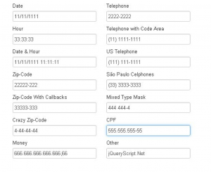
Visitors find it helpful to see default values in the form because they can see how the data is expected.

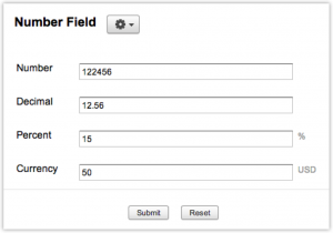
Fields should automatically enter formatting data – % or $

Make sure the fields are long enough to fit the users’ information
Use red asterisks to distinguish which fields are mandatory

Warn users if additional information is needed at the beginning of the form
Some registration forms might require ID details or any other information they might need to find because the information is not handy. Warn your visitors about this upfront.
Validate data
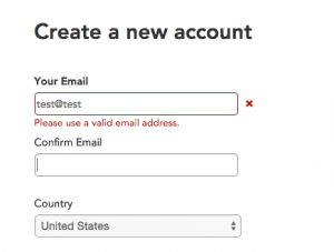
Validate data before the form gets submitted and when a form error occurs, the cursor should move to the first problem field.

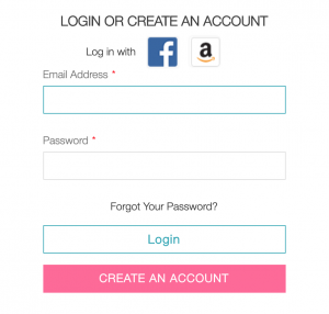
Social media logins increase registration rates by 20 to 40%, it’s very easy for the users to go through the registration process and it gives you more chances to expand your customer database.
Design for mobile too
Mobile design is not to be neglected, check how mobile-friendly your form here
Sign up forms can be exciting to create and with a bit of time and care you can definitely have a cool, modern and fun element on your website. The goal is to reduce friction so you can drive conversion rates up. Regardless of what you decide to do with your sign up forms, keep it short and simple, appealing and clear.
Our team has valuable information about how you can optimize your website. Contact us today!